
The funding status of public pension plans has been a frequent topic in the news recently. Looking at the actuarial funded ratio for state and local pension plans, the aggregate funded status of these plans has significantly declined over the last 15 years despite equities attaining all-time highs in recent periods. Though some of the reduction can be attributed to the impact of having two major market downturns during this period, we have seen that some plan sponsors have not been willing or able to contribute their actuarially determined requirements to help bridge the funding gap. As a result, and as plans are becoming more mature with increasing number of retirees, negative net cash flow has surfaced as a significant concern for public plan sponsors.
In our white paper, Negative Net Cash Flow: Red Flag or Red Herring, we introduced the topic of negative net cash flow and how it can affect public pensions. We concluded by offering three levers that plan sponsors can “pull” to help improve plan health: plan design, investment policy, and funding policy. Here we discuss one of those levers, investment policy, in more detail.
Addressing Plan Health
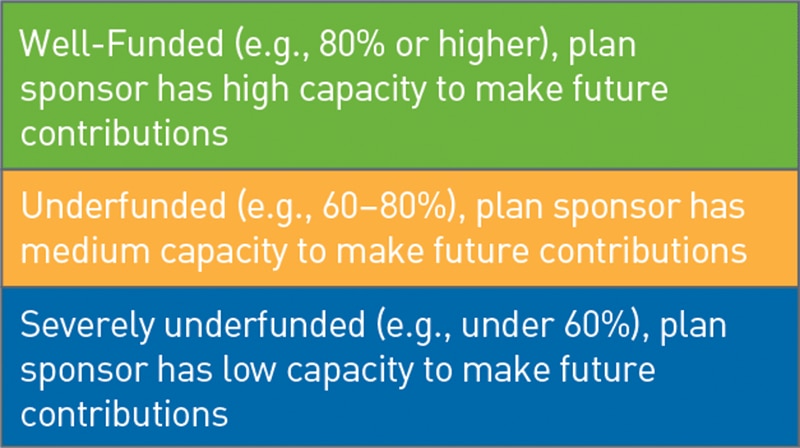
The investment lever does more to address plan health than it does actual negative net cash flow. Investment return is not a part of the equation for determining negative net cash flow. Therefore, increasing or decreasing investment returns would probably not have an immediate, first-order effect on calculating negative net cash flow. However, over the long term, increasing or decreasing projected investment returns can have a profound effect on plan funded status and a plan’s overall health, as illustrated in Chart 1. Here we highlight the “blue, yellow, and green” categories of plan health, with the intention for a plan to move from a blue or yellow status toward green.
Chart 1: Categories of Plan Health
Source: PNC
View accessible version of this chart.
Current Landscape
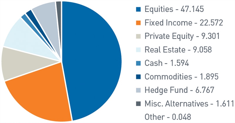
Before exploring investment policy options, we believe it’s important to understand the current status of public pensions. From an asset allocation perspective, state and local pensions tend to have the largest part of their allocation, on average, to public equities. This is not surprising to us, given the historically higher returns relative to, for example, fixed income, that could come from equity investments. The allocation to alternatives, at an average of 19.37% (as of the end of fiscal 2020), likely reflects the higher need for liquidity public pensions have relative to their institutional investor counterparts on the endowment and foundation side (Chart 2).
Investment Policy Levers
Every public pension plan is unique and will respond differently to investment policy changes. We recommend working with a combination of a plan’s board of directors, investment committee, investment advisor, and actuary, as applicable, before making changes to any investment portfolio.
Chart 2: Asset Allocation for State and Local Pensions, 2020
Source: Center for Retirement Research at Boston College
View accessible version of this chart.
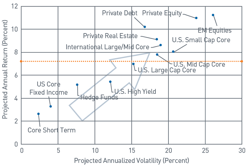
Chart 3: Risk-Reward Spectrum using PNC’s 2021 Capital Market Assumptions
Source: PNC
View accessible version of this chart.
Growth from Asset Allocation
The first investment policy lever focuses on asset allocation and is generally more applicable to plans that are in the yellow or green plan health categories, as seen in Chart 1. A properly positioned asset allocation can help support or generate the investment returns needed to improve funded status. For plans with a long time horizon (that is, more than 10 years), increasing allocations to equities and other growth-oriented asset classes in a prudent manner can help increase expected return and potential growth in the asset base. However, assets with higher return expectations tend to have higher short-term volatility, and some assets such as private equities can potentially increase a portfolio’s liquidity risk.
Chart 3 illustrates what this change to asset allocation would entail using the PNC 2021 Capital Market Assumptions. With the average assumed return in fiscal 2020 of 7.75% (orange line) as a guidepost, the basic premise is to increase returns by “moving up” on the chart by increasing allocation to asset classes with higher expected returns. However, by moving up, in most cases an investor is also “moving right” on the chart (moving out on the risk curve), meaning the investor is potentially increasing expected volatility. While this is a gross oversimplification of how expected portfolio volatility works as an aggregate of individual asset classes, it provides insight into how adding asset classes with higher projected returns can result in an increase in overall projected volatility.
Mitigating the Cash Flow Effect
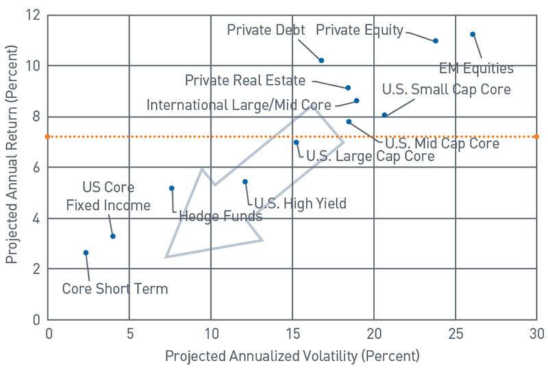
The second investment policy lever centers on mitigating the cash flow effect on the portfolio for a plan with significant negative net cash flow. This lever also tends to be more applicable to plans that are in the red plan health category as shown in Chart 1. The intended effect here is to mitigate some of the short-term effects that negative net cash flow has on plan health by increasing the liquidity available to make distributions. This lever would involve shifting the investment portfolio to more liquid asset classes, specifically short-term, cash-generating investments. The benefit to this is that the additional liquidity may help the portfolio make cash distributions without having to generate liquidity at the cost of a discount to market value (for securities with less liquidity or that experience short-term volatility). Returning to the PNC 2021 Capital Market Assumptions in Chart 4, this policy is essentially “moving down and to the left.” The downside to this, however, is that increasing liquid asset classes reduces the expected return, potentially requiring the plan sponsor to increase annual contributions to make up the shortfall.
Chart 4: Risk-Reward Spectrum using PNC’s 2021 Capital Market Assumptions
Source: PNC
View accessible version of this chart.
Pulling either of the two levers could have an impact on the actuarially determined rate, with two options.
- Option one, seeking to increase expected return, could potentially increase the actuarially determined rate of return, that is, the assumed return.
- Option two, seeking to increase the liquidity of the portfolio, could potentially decrease the actuarially determined rate of return if removing higher return investments.
The potential impact of changes in the discount rate is that a higher actuarially determined rate of return could result in lower annual required contributions. A lower actuarially determined rate of return could result in higher annual required contributions. Either can have a significant impact on plan health over time.
Key Takeaways
There are several key considerations for plan sponsors looking to increase their projected returns. Because of the volatility and liquidity risks, making changes to asset allocation requires careful consideration and collaboration with the investment manager or consultant to determine if the plan sponsor is willing to accept those risks in light of the potential for increased returns. There are also considerations for plan sponsors looking to increase liquidity and/or decrease volatility. Given the potential for an increase in the required annual contribution, plan sponsors should likewise collaborate with the investment manager, actuary, and any board, finance, or budgeting committee, as applicable. This step would be necessary in helping to determine if higher contributions are possible for a given fiscal budget.
Conclusion
As we mentioned in our white paper Negative Net Cash Flow: Red Flag or Red Herring, it may be better to use multiple levers (out of plan policy, investment policy, and funding policy) in tandem as opposed to pulling a single one. What if all of the pressure were placed on investment policy, or any one policy for that matter, for solving the problem? Using a single lever might require that the magnitude of change necessary to create the desired outcome could introduce a higher aggregate level of enterprise risk than could otherwise be achieved by changing multiple levels in tandem in a more moderate fashion. For that reason, we believe it is beneficial to consider the different options available to a given public plan sponsor holistically to determine what is best for a given public pension plan.
Accessible Version of Charts
Chart 1: Categories of Plan Health
| Green: Well-Funded (e.g., 80% or higher), plan sponsor has high capacity to make future contributions |
| Yellow: Underfunded (e.g., 60–80%), plan sponsor has medium capacity to make future contributions |
| Blue: Severely underfunded (e.g., under 60%), plan sponsor has low capacity to make future contributions |
Chart 2: Asset Allocation for State and Local Pensions, 2020
| Category | Percent |
| Equities | 47.145 |
| Fixed Income | 22.572 |
| Private Equity | 9.301 |
| Real Estate | 9.058 |
| Cash | 1.594 |
| Other | 0.048 |
| Commodities | 1.895 |
| Hedge Fund | 6.767 |
| Misc. Alternatives | 1.611 |
Chart 3: Risk-Reward Spectrum using PNC’s 2021 Capital Market Assumptions
| Core Short Term | U.S. Core Fixed Income | Hedge Funds | U.S. High Yield | U.S. Large Cap Core | U.S. Mid Cap Core | U.S. Small Cap Core | International Large/Mid Core | |
| Projected Annual Return | 2.60% | 3.25% | 5.15% | 5.40% | 6.95% | 7.75% | 8.00% | 8.60% |
| Projected Annual Volatility | 2.35% | 4.00% | 7.65% | 12.15% | 15.30% | 18.55% | 20.70% | 18.95% |
Arrow moves toward higher projected return/higher volatility
| Private Real Estate | Private Debt | Private Equity | EM Equities | |
| Projected Annual Return | 9.10% | 10.15% | 10.95% | 11.20% |
| Projected Annual Volatility | 18.50% | 16.85% | 23.85% | 26.15% |
Arrow moves toward higher projected return/higher volatility
Chart 4: Risk-Reward Spectrum using PNC’s 2021 Capital Market Assumptions
| Core Short Term | U.S. Core Fixed Income | Hedge Funds | U.S. High Yield | U.S. Large Cap Core | U.S. Mid Cap Core | U.S. Small Cap Core | International Large/Mid Core | |
| Projected Annual Return | 2.60% | 3.25% | 5.15% | 5.40% | 6.95% | 7.75% | 8.00% | 8.60% |
| Projected Annual Volatility | 2.35% | 4.00% | 7.65% | 12.15% | 15.30% | 18.55% | 20.70% | 18.95% |
Arrow moves toward lower projected return/lower volatility
| Private Real Estate | Private Debt | Private Equity | EM Equities | |
| Projected Annual Return | 9.10% | 10.15% | 10.95% | 11.20% |
| Projected Annual Volatility | 18.50% | 16.85% | 23.85% | 26.15% |
Arrow moves toward lower projected return/lower volatility